Great Room Before
This photo was taken on move-in day (apparently we needed a fire while moving in ... with the windows open). This was before any new accent paint. It's also photographic evidence of my husband's first attempt to show me that our old TV was too small and bulky for the new house. Sneaky.
Great Room After
Ta da! The colors are a little off -- I've taken the photos about three times and can't find a time of day where the lighting looks accurate. So the oranges are a little orange-er, but you get the picture. We painted the tall fireplace wall an accent color to help make it pop (Benjamin Moore Shenandoah Taupe AC 36, which is the same as the accent color in our entryway).
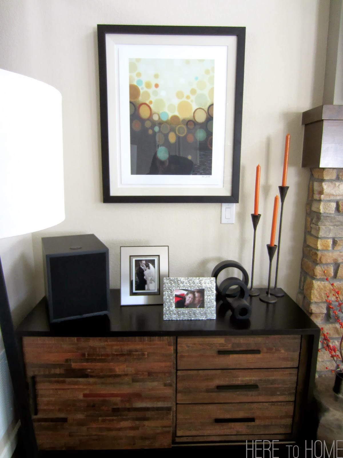
Photos from each side of the fireplace. We chose to not add the optional windows to both sides of the fireplace as we wanted a place to hang up some art. Given how close the houses are and how awesome the art looks, I think we made the right decision.
Our great room is two-stories. We had a couple options when it came to what we could have done with the stone and mantel around the fireplace (stone to ceiling, hearth vs. mantel). We've seen a couple options in our neighbors homes and they all look great. We're really happy with what we've chosen for our style. However, I think if we would have chosen stone to the ceiling, we would have gone with the hearth option.
Probably the best before and after photo.
These side tables were another atypical purchase for me and ended up being one of my most favorite things in the room. They don't take up a ton of space, but they're substantial -- most importantly they have a ton of character. Love them!
The table the started it all. Out of the room, in the room - I absolutely adore it. We receive a ton of compliments on it and truly is the statement piece we were looking for.
Another look (and even a glimpse into the dining room and kitchen).
How about some detail photos. My plan is to rotate out the orange accents with some green ones for the spring and summer.
Looking up the stairs and back toward the front door.
These are the bar stools that we chose. This was another really long debate as we wanted a stool that complimented the great room, but we weren't sure if we wanted something that swiveled or something with a back. In the end, we chose these tractor stools from Restoration Hardware. The seat is amazingly comfortable and while they do tend to get hidden behind the couch as you'll see in the photo below, look amazing when you can see them.
Ending up the reveal with a peek into the kitchen, which is where I'll focus next post, but for now I'm excited to finally show off my favorite room.


It is a "great" room!
ReplyDelete